Fujirebio is a world-leading developer of immunoassays – tests used to help diagnose a wide range of medical conditions. It recently decided to place more specific focus on the area of neurodegenerative diseases, in particular its unique capabilities in helping to diagnose Alzheimer’s disease. Having set up a hub of expertise and research in Belgium, it came to Dark Grey Europe for advice on defining a brand position and brand identity for the centre. This was part of a wider repositioning of the whole company as they refocused their entire global marketing efforts.
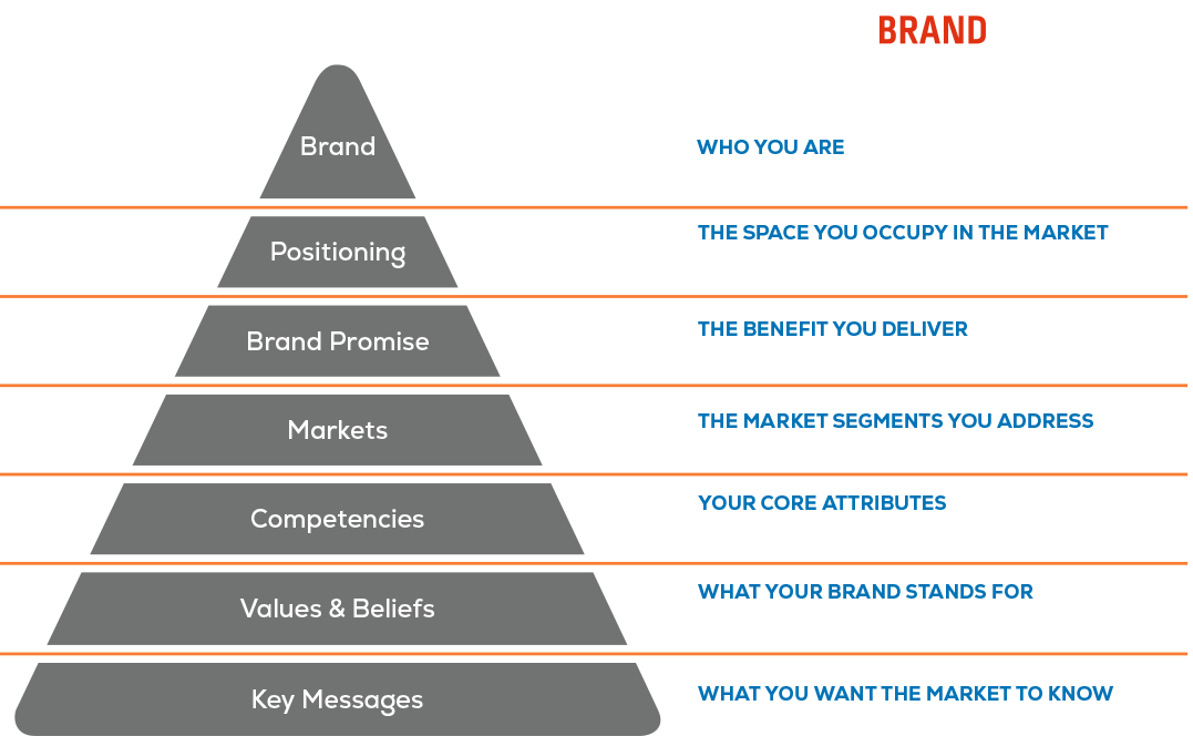
Brand navigator methodology

Christiaan De Wilde, European CEO & Global Head for Neuro at Fujirebio
Fujirebio: pioneers and innovators
The company specialises in in-vitro diagnostics – basically, that means tests carried out in a lab to diagnose many conditions from cancer to Alzheimer’s. Not only did they launch the world’s first biomarker for early detection of Alzheimer’s disease in 1995, they pioneered fully automated testing which greatly increased the speed and efficiency with which patients can get their diagnosis and, ultimately, their treatment.
For over 50 years Fujirebio has been innovating, developing, producing and marketing high quality in-vitro diagnostics testing solutions in Europe, Asia and the USA. For many of those years it has also been closely associated with the fight to defeat dementia in particular and has gathered a team of highly specialised and knowledgeable professionals to tackle this most urgent of tasks.
Using Brand Navigator methodology to move to a new brand position
Given the proposal to create a focal point in Ghent for global research and cooperation into Alzheimer’s solutions, our starting point was how to position this new resource in the market. That’s where our Brand Navigator methodology came in.
The methodology is based on the fact that only a fraction of the information, knowledge and lessons about any company, its brand, products, customers and competitors is recorded in presentations or in documents. Most of this valuable information is stored in the busy brains of the company management and its people. To get to really useful marketing insights, it’s necessary to delve deep into those minds though extensive discussion. And it means auditing a company’s current communications with regard to everything from markets and DMUs to brand image and market dynamics.
Uncovering insights to start the brand positioning
To get to the heart of things we set up in-depth interviews with some of the key players at Fujirebio. That included its European CEO Christiaan De Wilde as well as stakeholders from marketing and sales. Only by finding out their unique perspectives on every aspect of the venture would it be possible to define the ideal positioning. A series of lengthy interviews were set up (COVID dictated that they were remote meetings, of course) in which we explored every aspect of the new hub, Including how it should contribute to people’s overall impression of the company and its potential obstacles and objections.
“For over 50 years Fujirebio has been innovating, developing, producing and marketing high quality in-vitro diagnostics testing solutions in Europe, Asia and the USA”
The brand strategy
From the findings, we began to develop a brand strategy. The creation of a compelling story was key here, together with the name and image for the centre.
The brand story
Every brand needs a story. It’s what connects people to a product or service and defines how they feel about a particular company. But coming up with one that’s both credible and appealing is easier said than done. It must be rooted in fact, of course, but its nuances can introduce real personality to a brand – making it caring, visionary, aspirational, futuristic… you name it.
The brand name
In parallel, dozens of names were considered, each with its own nuance of meaning. Should it be ‘Neuro Hub’ or ‘Neuro Beacon’ or even ‘Inspiro-Neuro’? Analysing names against the positioning story helped with defining the final choice. In the end, the ‘Fujirebio Neuro Center of Excellence’ was chosen for its straightforward, clear and descriptive approach that was also respectful to the sensitive nature of Alzheimer’s research. And, of course, we adopted the American spelling – ‘center’ – in acknowledgement that this was a global initiative for Fujirebio.
The brand identity
An identifier for the center followed – how best to capture the values, motivations and characteristics identified in the initial research? The graphic identity needed to be clear and approachable, serious yet non-threatening to appeal to a range of target audiences from researchers and clinicians to patients themselves and their carers. It also had to be clear how this would work in relation to other corporate and product marks. After careful consideration and testing, the final brand identity came to life:

Final Brand image Fujirebio Neuro Center of Excellence
“For the Center of Excellence we wrote a story that communicates complex messaging about difficult topics in a readable – and, above all, human – way.”
Just the start
Together, the name, brand story and graphic identity formed a complete and coherent package, ideal for both internal and external communications. Given the success of this repositioning exercise for one element of the Fujirebio landscape, we were then asked to participate in a repositioning of the entire company. The objectives were to present Fujirebio’s geographically disparate operations as a single, global entity – one global team – and to reset its fundamental proposition to the market to be seen as both a pioneer and a partner. As with the Center of Excellence, the Brand Navigator kicked in. In depth discussion with the company’s CEO in Japan helped define the necessary new messaging in order to create separate ‘stories’ for the main pillars of the Fujirebio offer.
These were written and with some minor tweaks were quickly approved for use on the newly updated corporate website. The stories were all different but ultimately had the same ending: higher visibility and greater emotional clarity for the brand than ever.


